
Idea Capital Gears Up for a New Logo and a New Look
We love the fresh and spring-timey logo we’ve been using since 2010. But it’s time for a pivot!
This fall, we’re leaning into our reputation for recognizing brave and experimental artists before others have figured out what they’re up to.
We hope the new logo we reveal this week will help communicate that message. We’ll be doing more to help make our artists visible on a local and global stage. Our new look will be for the artists who push and the art that pushes back.
For the design nerds out there, here’s a brief history of the Idea Capital logo!
In 2008, the earliest form of a “logo” was simply the typed-out words “Idea Capital”:
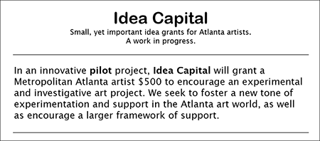
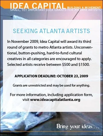
In 2009, once we moved beyond the pilot project phase and into functioning as a full-fledged organization, a rudimentary, all-type, one-color logo was used:
A full-color logo designed by an anonymous designer came into use in 2010. It was almost always used against the brown background:
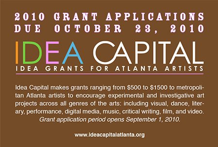
The colors were inspired by the designer’s favorite childhood treat: rainbow sherbet.

Image of rainbow sherbet cone from Bramble Berry.
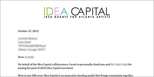
By 2012, the cleaner, white-background version became the predominant version of the logo used:
Around 2016 and 2017, the rainbow logo fell out of common use with the organization, as a number of other graphic treatments came to the fore:
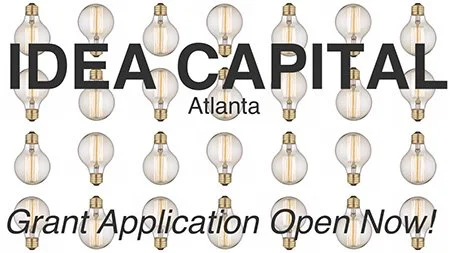
By 2020, the rainbow logo was back in use:
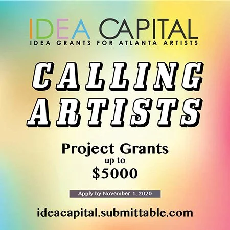
As of 2026, the current logo still has many variations for different use cases. However, the full-color rainbow on a white background remains the most commonly used:
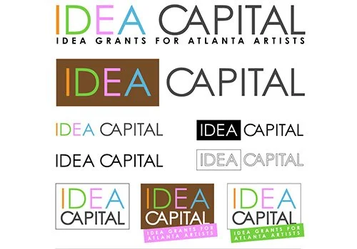
Now we’re moving into a new phase; we are asking the world to take us more seriously and to take you the artists more seriously as change makers. We want to create a new graphic identity that honors that commitment, and yet retains the legacy of inspiration, possibility and experimentation.
Stay tuned for what’s next!